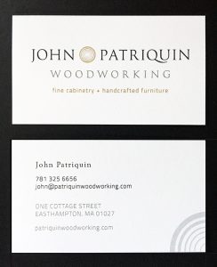
Our new logo for Patriquin Woodworking lent itself to a clean, sophisticated and simple identity which we then applied to stationery, business cards, notes, rack cards and signage.
Patriquin Woodworking
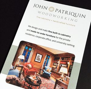
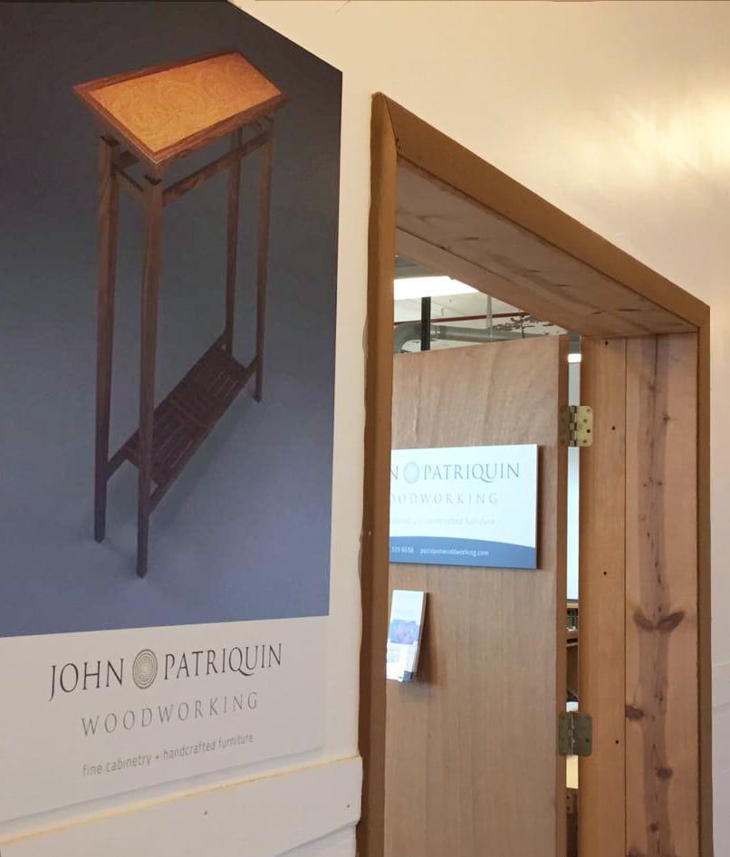
Our new logo for Patriquin Woodworking lent itself to a clean, sophisticated and simple identity which we then applied to stationery, business cards, notes, rack cards and signage.
Patriquin Woodworking
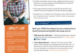
Leave ’Em Kinder™ is a program designed primarily for middle school students (grades 4-8) that addresses the core competencies of Social Emotional Learning (SEL) through song. Our goal was to create a clean, clear one-sheet to outline the program for potential customers (think PTAs, PTOs, school administrators and teachers) that could be emailed or downloaded….
Berkshire Community Development (BCD) is a new company based in Great Barrington, MA, that provides moderate- to low-income residents with housing rehabilitation services. This includes management of grant funding, providing assistance to beneficiaries within Berkshire County to make critical repairs to their homes and working with government entities who have been awarded funds. The first…
The Hull Public Library reached out to us to develop something more of a logo for them. They had been using a line drawing of the library façade on their annual book sale totebags, but felt they needed something more formal that could also be applied to the website, print materials, etc. Requirements for the…
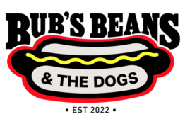
What to do when your kids don’t want to go to summer camp? You buy a food cart and put them to work! We designed the logo for Bub’s Beans & the Dogs and now they’re off and running for the summer season. Catch them in Sandisfield, Massachusetts, and across the Berkshires – Follow them on…
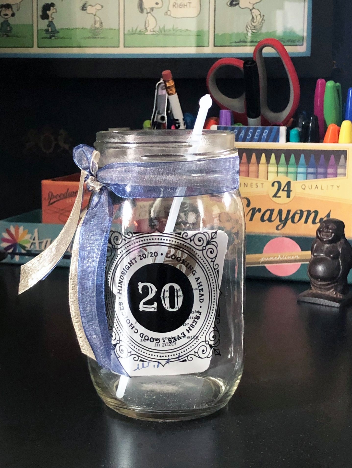
Each year, we design and develop a custom, limited-edition gift for the clients we’ve worked with during the year. We try to come up with unique, interesting and fun ideas that will have some shelf life, whether on a desk or at home. As we closed out 2019, we wanted to celebrate the arrival…
Kathleen has a lovely quilting blog and really wanted a professional logo that would lend itself to appropriate branding for the quilt pattern industry. We explored several options including the use of pins and quilting triangles, but arrived at this block pattern design. Visit Kathleen McMusing for more information.
new original We first developed a logo for Squillace in 2007 when they initially launched their firm. They came back to us in late 2017 to revisit the mark again as they celebrated their 10th anniversary and prepared for an office move. Similar to the existing logo, they wanted the new logo to strive for…
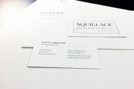
Once we completed the logo redesign for Squillace, we went ahead and applied our new logo to our suite of print materials: business cards, stationery, pocket folders, notecards and note pads.
©2000-2026 iron blender studios. All rights reserved.