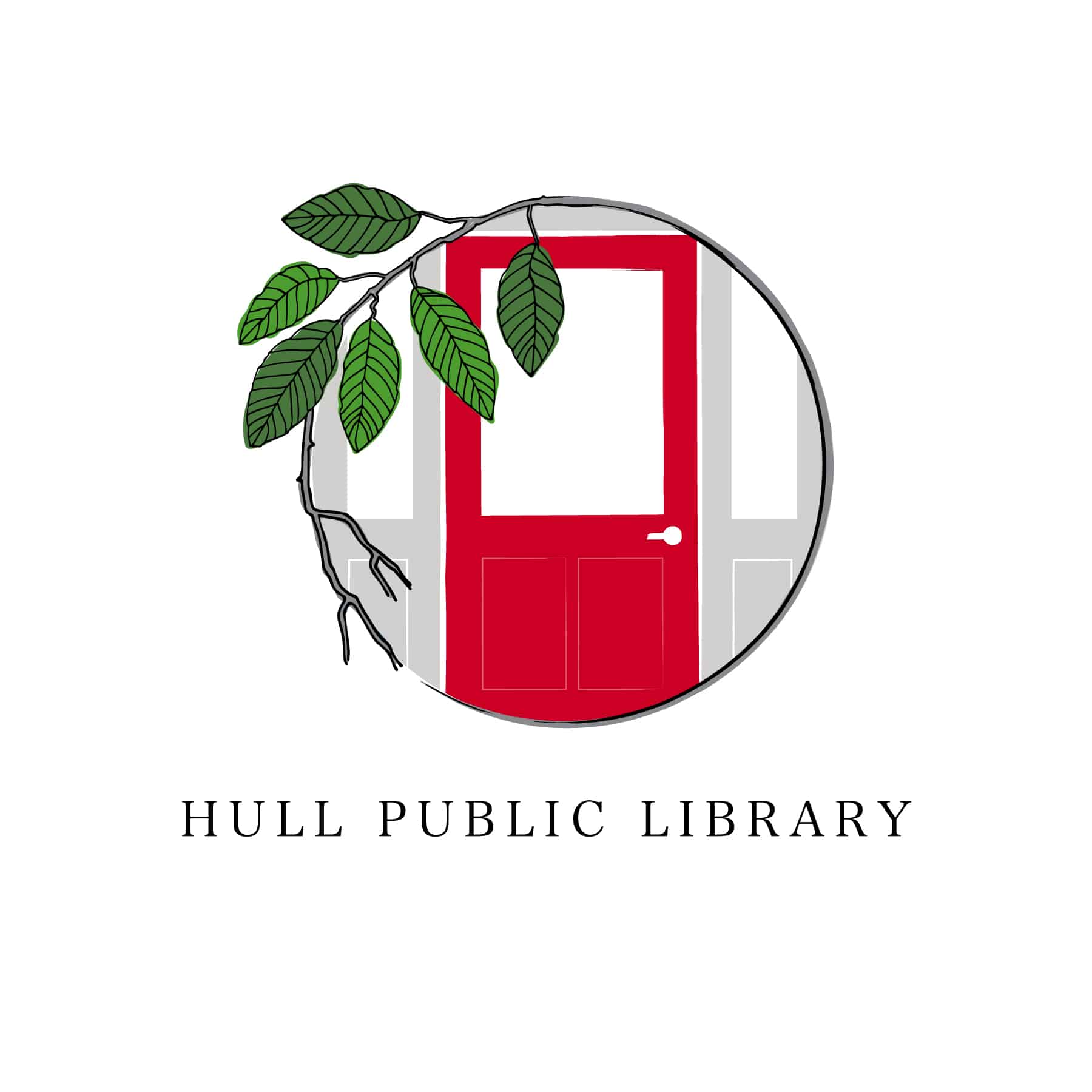
The Hull Public Library reached out to us to develop a more formal logo for them to use in library materials. They had been using a line drawing of the library façade on their annual book sale totebags, but felt they needed something more official/professional that could also be applied to the website, print materials, etc.
Requirements for the logo: Include two key elements that are important to the building’s physical identity – the Talbot’s red door and the Camperdown elm. We simplified the elm to complement and frame the door, and selected greens that veer away from a Christmas green and more toward a yellow-green. The result is a simple, bold mark that will work well in many formats and applications.


